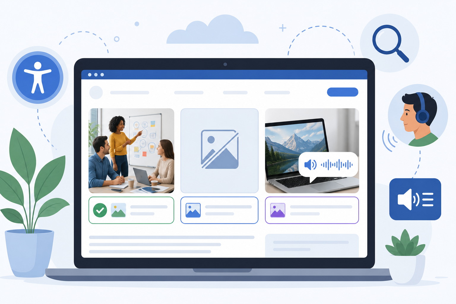
I’ve been optimizing websites for a long time. And if there’s one thing I’ve noticed, it’s this: alt text is the single most overlooked accessibility feature on the web.
Most site owners think of alt text as an SEO thing. Something you add for Google. And yes, it does help with SEO. But that’s not why it exists. Alt text was created to make images accessible to people who can’t see them. Everything else, including the SEO benefit, came later.
In this guide, I’ll walk you through exactly how image alt text helps website accessibility. I’ll cover what it does, who it helps, how to write it well, how to test it, and how to know when it’s actually working. If you run a website and care about doing accessibility right, this is everything I wish someone had told me years ago.
What Is Alt Text for Images?
Alt text, short for alternative text, is a written description you add to an image using the HTML alt attribute. Most visitors never see it. But for some users, it’s the only way they can understand what an image on your page shows.
Here’s what a basic image with alt text looks like in HTML:
<img src=”team-photo.jpg” alt=”Marketing team collaborating around a whiteboard.”>
The description inside the alt=”” is the alt text. That’s it. Nothing fancy. But that small piece of text does a lot of work behind the scenes.
Alt text serves as a functional substitute for the image. That’s the key word: functional. It’s not just a description of what’s in the image. It’s meant to give someone who can’t see the image the same information they would get if they could.
That distinction matters. And it’s what most alt text guides get wrong.
Who Actually Depends on Alt Text?
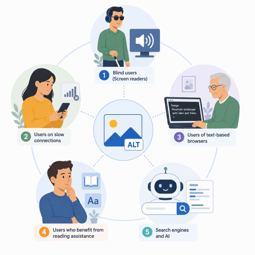
When I first started writing alt text, I assumed it was only for blind users. I was wrong. There are actually several groups of people who benefit from good alt text, and understanding who they are helps you write better descriptions.
People who use screen readers
This is the group most commonly associated with alt text. Screen readers are software programs that read webpage content aloud. They’re used by people who are blind or have low vision.
When a screen reader reaches an image, it doesn’t try to “see” it. It reads the alt text out loud instead. If the alt text is good, the user gets a clear picture of what the image shows. If it’s missing or unhelpful, they get nothing useful.
The most common screen readers today are NVDA and JAWS on Windows, VoiceOver on Mac and iOS, and TalkBack on Android. Each one handles alt text slightly differently, but they all rely on the same underlying HTML attribute.
People on slow or metered connections
I don’t think this group gets talked about enough. Around the world, millions of people access the internet on slow connections or with data limits. Some of them intentionally turn off images in their browsers to save data. Others are on connections where images sometimes just don’t load.
When an image fails to load or is disabled, the alt text appears in its place. Without alt text, they see nothing but an empty box. With good alt text, they still get the information the image was meant to convey.
People using text-only browsers or older devices
Some users still browse the web using text-only browsers, either by choice or by necessity. Others use older devices where image rendering is unreliable. For all of them, alt text is the fallback that keeps your content usable.
People with cognitive disabilities
This one surprises a lot of people. Alt text can also help users with certain cognitive disabilities, particularly those who process text more easily than complex visual information. Simple, clear alt text can actually make an image easier to understand than the image itself.
Search engines and AI systems
I know this section is about accessibility, but it’s worth mentioning. Google, Bing, and modern AI systems all use alt text to understand what images show. That’s an SEO benefit, but it’s also an accessibility benefit in a broader sense. When AI systems can accurately identify what’s on a page, they can serve it better to the users who need it.
How Alt Text Actually Helps Accessibility
Now let me get into the specific ways alt text improves accessibility. This is the heart of the topic.
1. It makes images usable for screen reader users
This is the primary function. Screen readers read alt text aloud, which lets blind and low-vision users understand images they can’t see.
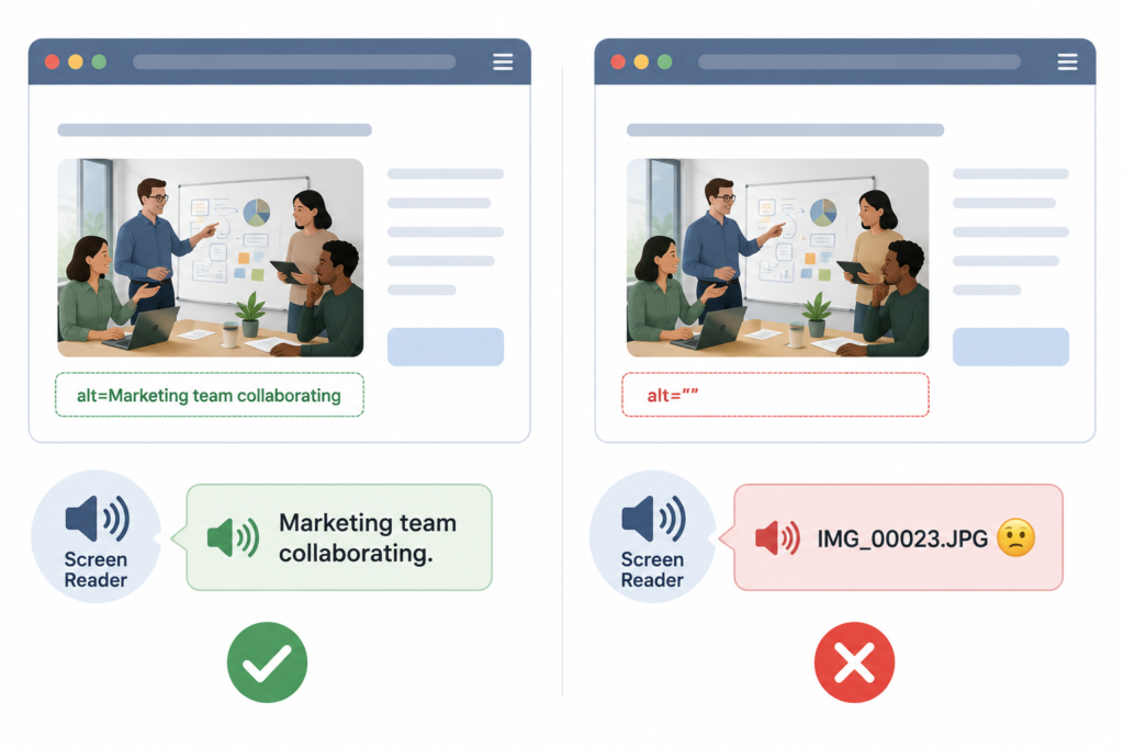
Without alt text, a screen reader has a few unhelpful options. It might announce “image without description,” which leaves a confusing blank space in the content. Or, if the alt attribute is missing entirely (not just empty, but completely absent from the HTML), the screen reader might read the image filename aloud instead. If your filename is something like IMG_00023.jpg, the user hears “I-M-G underscore zero zero zero two three dot jay pee gee.” That’s not just useless. It’s frustrating.
The fix is simple. Every meaningful image needs alt text. Every decorative image needs an empty alt attribute (alt=””). And no image should ever have a missing alt attribute.
2. It provides a backup when images fail
I’ve had this happen on my own website more times than I’d like to admit. Something breaks in the image delivery pipeline. Maybe a CDN goes down. Maybe a file gets accidentally deleted. Maybe a plugin changes an image URL. Whatever the reason, some percentage of your images will fail to load at some point.
When that happens, browsers display the alt text in place of the broken image. If you wrote good alt text, the user still gets the message. If you didn’t, they see an empty box or a broken image icon.
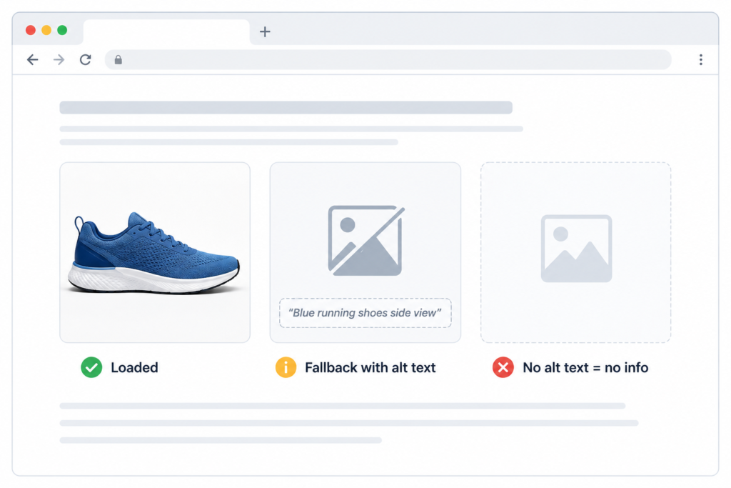
This isn’t just theoretical. I’ve watched analytics on sites where images regularly fail to load for users on slow connections. The bounce rate on those sessions is significantly higher when alt text is missing. Users on failing image loads who can still read the alt text stay longer and engage more.
3. It conveys function for interactive images
Not every image is decorative. Many images serve a functional role on a page. Product photos that are also links. Icons that trigger actions. Buttons that use images instead of text.
For all of these, alt text is what tells assistive technology what the image does, not just what it looks like.
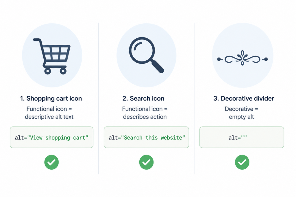
Take a shopping cart icon in a website header. Visually, it’s a shopping cart. Functionally, it’s a link to the cart page. The alt text should reflect the function: alt=”View shopping cart”, not alt=”Shopping cart icon”. That way, a screen reader user knows what will happen when they activate the link, not just what it looks like.
Same principle for a company logo that links to the homepage. alt=”WebAshes homepage” is more useful than alt=”WebAshes logo” because it tells the user where the link goes.
4. It gives access to complex information
Charts, graphs, infographics, and diagrams are a special case. They often contain a lot of information packed into a visual format. Alt text can’t fully replace that information, but it can point users toward it.
I’ll get into how to handle complex images in more detail later. But the short version: complex images need a two-part approach. A brief alt text summary in the image tag, and a fuller explanation in the surrounding page content. Together, they give non-visual users access to the same information that sighted users get from the image.
5. It captures emotion and intent
This is the part of alt text writing that most guides skip. And honestly, it’s the part I find most interesting.
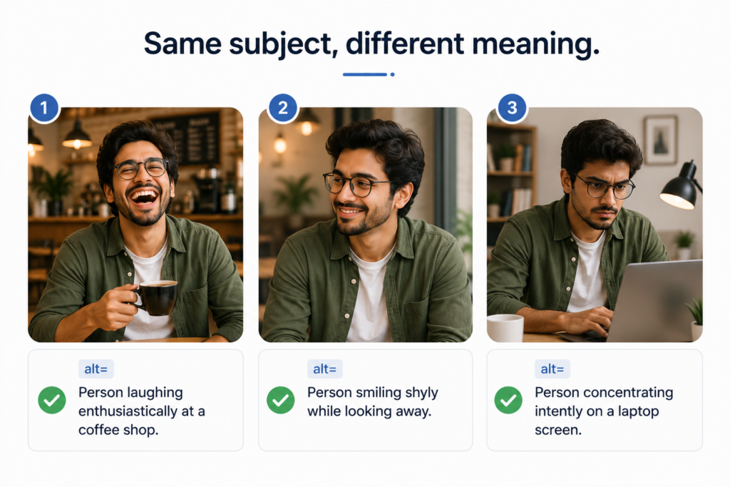
Images don’t just show things. They convey meaning. A photo of someone smiling shyly is different from a photo of someone laughing loudly, even if the caption for both is just “person laughing.” A photo of a person “cheekily hiding behind a plant” isn’t the same as a photo of “a person standing next to a plant.” The mood, the intent, the emotional register — all of that is information that sighted users pick up automatically.
Good alt text captures that. It doesn’t just describe pixels. It describes what the image is trying to say.
When I write alt text for a photo of a person, I try to include not just what they’re doing but how they’re doing it. Are they focused? Playful? Frustrated? Confident? Those cues change what the image communicates. And screen reader users deserve access to them just like anyone else.
6. It improves the auditory flow of your content
Here’s something I only learned after listening to screen readers read my own pages: alt text isn’t just about what you say. It’s about how the screen reader says it.
A period at the end of your alt text tells the screen reader to pause before moving on to the next element. Without that pause, the alt text runs together with the following text, which can be confusing. So even though a period isn’t strictly required by HTML, I always add one. It creates the natural break that makes the page easier to listen to.
Same reason I avoid ALL CAPS in alt text. Screen readers sometimes interpret all-caps words as acronyms and read each letter individually. If your alt text says alt=”SALE ON NOW”, a screen reader might read it as “S-A-L-E O-N N-O-W,” which is not what you want.
And I always avoid starting alt text with “image of” or “photo of.” Screen readers already announce that the element is an image. Adding “image of” makes the announcement redundant. The user hears “image, image of a red bicycle.” Once is enough.
Examples of Alt Text for Accessibility
Let me give you some concrete examples of alt text that works for accessibility across different image types.
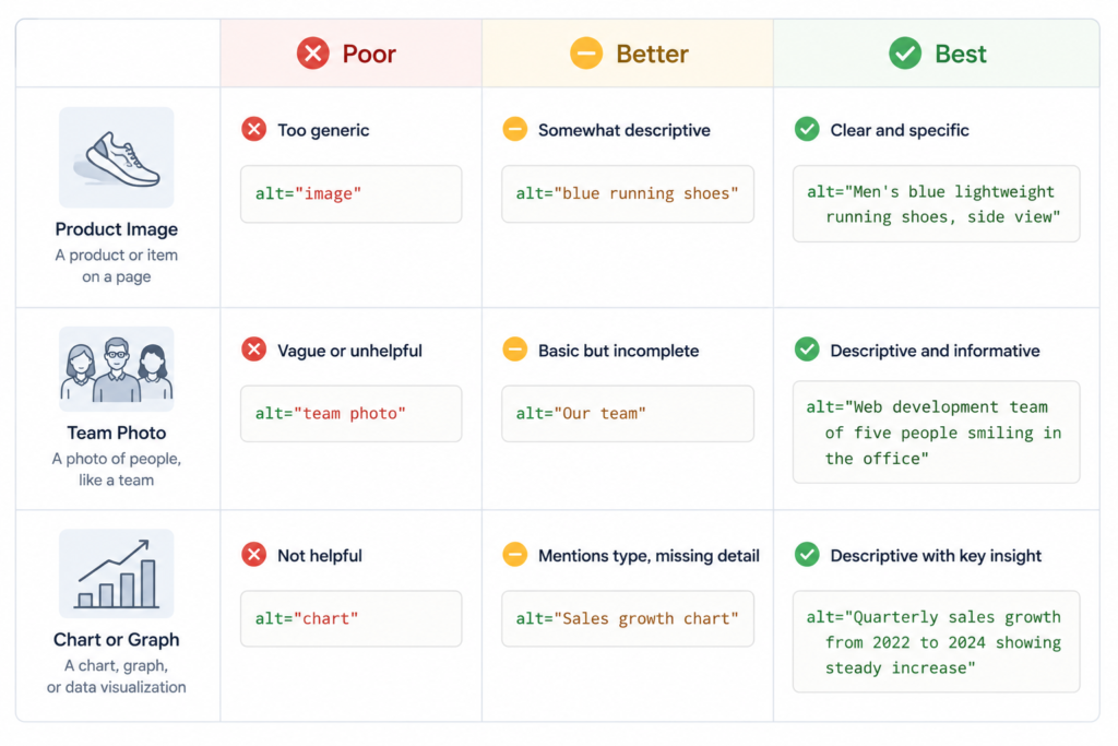
For a product image on an e-commerce site
Poor: alt=”shoes”
Better: alt=”Red canvas high-top sneakers with white laces.”
Best: alt=”Red canvas high-top sneakers with white laces, side view showing the rubber sole and canvas texture.”
The last version tells someone who can’t see the image what makes this product visually distinct. That’s what a sighted user would notice at a glance.
For a team photo on an “About Us” page
Poor: alt=”team photo”
Better: alt=”Marketing team standing together.”
Best: alt=”Marketing team of eight people standing in front of a whiteboard covered in strategy notes, all smiling toward the camera.”
The best version conveys the setting, the size of the team, and the mood. All of that is information that sighted users get instantly.
For an icon used as a link
Poor: alt=”icon”
Better: alt=”Search”
Best: alt=”Search this website”
Alt text for icons should describe what the icon does, not just what it looks like. “Search” tells the user what will happen when they activate the link.
For a decorative divider
alt=””
That’s it. Decorative images don’t need descriptions. They need empty alt attributes so screen readers skip them entirely.
For a chart or graph
Poor: alt=”chart”
Better: alt=”Bar chart showing quarterly revenue.”
Best: alt=”Bar chart showing quarterly revenue from 2022 to 2025, with steady growth each year; see the data table below for exact figures.”
The best version summarizes what the chart shows and points the user to where they can access the full data.
How to Write Alt Text for Accessibility
Now I’ll walk you through my actual process for writing alt text. This is the workflow I use every time.
Step 1: Ask the disappearance question
Before I write anything, I ask myself: “If this image disappeared from the page, what would someone still need to know?”
The answer to that question is my alt text.
If the answer is “nothing important,” the image is decorative and gets an empty alt attribute. If the answer is a specific piece of information, that’s what goes in the alt text.
This one question has saved me from writing bad alt text more times than I can count.
Step 2: Check the surrounding context
The same image can need different alt text on different pages. I always check what the image is doing in the context where it appears.
Say I have a photo of a laptop. On a page about remote work productivity, the alt text might focus on “Person working from home on a laptop.” On a page about back pain from desk work, the alt text might focus on “Person hunched over a laptop, showing poor posture.” Same image. Different meaning. Different alt text.
Context determines everything.
Step 3: Keep it concise
Most screen readers cut off alt text after around 125 characters. Some guidelines suggest keeping it under 10 words. My personal rule: write it as short as possible while still conveying what matters.
Long alt text interrupts the reading flow. Short, vague alt text doesn’t give enough information. The sweet spot is a single clear sentence.
Step 4: Write it, then read it aloud
This is my final check. I read the alt text out loud. If it sounds natural, it’s good. If it sounds like a search query or a list of keywords, it needs to be rewritten.
Screen readers read alt text out loud. So the way it sounds matters. Writing for the ear is different from writing for the eye.
Step 5: End with a period
Always. It creates the auditory pause that makes screen readers work smoothly.
How to Write Effective Alt Text for Complex Infographics
Complex images are where a lot of accessibility efforts break down. Charts, graphs, flowcharts, maps, and infographics contain more information than can fit in a standard alt text description.
Here’s how I handle them.
The two-part strategy
For any complex image, I use a two-part approach.
Part one is the alt text itself. It provides a short summary of what the image shows and tells the user where to find the fuller explanation. Something like: alt=”Infographic showing the customer journey from awareness to purchase; see the process breakdown below.”
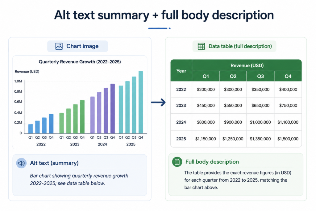
Part two is the fuller explanation in the surrounding page content. For a chart, this might be a data table. For a flowchart, a step-by-step written breakdown. For a map, a descriptive paragraph. The point is that all users, whether or not they can see the image, have access to the same information.
Why I don’t use longdesc
Some older accessibility guides recommend using the longdesc attribute for complex images. I don’t recommend it anymore. Most modern screen readers don’t support it well, and it’s considered obsolete. Stick to visible body text or a linked page.
What to include in the body description
For a bar chart or graph: include the actual data. A data table alongside the chart is the gold standard. It’s searchable, selectable, and accessible to everyone.
For a flowchart: describe the steps in order, using headings or a numbered list. Each step should be understandable on its own.
For a map: describe what the map is showing and any patterns or key points. If the map shows the regional distribution of something, describe the distribution in text.
For an infographic: this is where things get harder. Infographics often mix charts, icons, headings, and short blocks of text. The best approach is to reconstruct the infographic’s content as regular HTML on the page. Headings become <h2> and <h3> tags. Data becomes tables. Icons with labels become simple text. This isn’t just accessible. It’s also better for SEO because the content is now indexable.
Screenshots of tweets or text-heavy images
I see this mistake constantly. Someone shares a screenshot of a tweet or an article and writes alt=”screenshot of a tweet”. That’s useless.
If the whole point of the image is the text inside it, the alt text should include the actual text. Type out what the tweet or article says. That’s the information the user needs.
Memes
For memes, describe the image and include the text. Something like: alt=”Meme of Doctor Evil making air quotes. Text reads: Disclaimer? Right.”
If the meme has been edited (like a logo photoshopped out or replaced), note that. It provides context that changes the meaning.
How to Evaluate Alt Text Accessibility on a Website
Writing alt text is one thing. Making sure it actually works for accessibility is another. Here’s how I evaluate the alt text on the sites I work on.
Automated tools I actually use
Automated tools are great for catching missing alt attributes across a large site. They can’t judge the quality of the descriptions, but they can flag the biggest gaps.
Chrome DevTools Lighthouse is my starting point. It’s built into Chrome and free. Open DevTools, go to the Lighthouse tab, run an accessibility audit, and it’ll flag every image on the page that’s missing an alt attribute or has other accessibility issues.
WAVE by WebAIM is another one I use often. It shows accessibility issues directly on the page with visual icons. Good for spotting problems quickly.
Axe DevTools is a browser extension that does deeper accessibility auditing than Lighthouse. Useful for larger sites.
Screaming Frog is what I use for site-wide audits. It can crawl the entire site and export a list of every image and its alt attribute, including which images are missing alt text entirely.
For WordPress sites specifically, plugins like Accessibility Checker or WP Accessibility can scan pages as you edit them and flag issues before publishing.
Manual testing methods
This is where the real accessibility check happens. Automated tools can’t tell you if the alt text is meaningful. Only a human can do that.
The Hand Over test: I literally place my hand over the image on the screen. If I feel like I’m missing important information, the image needs descriptive alt text. If nothing changes, it’s probably decorative and should have an empty alt attribute.
The Disappearance question: What would someone still need to know if the image disappeared? That’s my alt text.
Inspect the code: I right-click the image, click Inspect, and look at the actual alt attribute in the HTML. This tells me what a screen reader is actually reading. If it’s missing, empty when it shouldn’t be, or contains poor descriptions, I know what to fix.
Slow network simulation: In Chrome DevTools, I go to the Network tab, throttle the connection to “Slow 3G” or “Offline,” and reload the page. Images fail to load, and alt text appears in their place. This is the closest thing to seeing what a user on a bad connection would experience.
Use an actual screen reader: This is the test that changed how I write alt text. Nothing teaches you the impact of alt text like listening to a page being read out loud. Turn on VoiceOver (Mac) with Command+F5 or install NVDA (Windows, free) and navigate a page using only the keyboard. You’ll hear exactly how your alt text sounds.
What I check during a review
When I audit a site’s alt text for accessibility, I go through this checklist:
Every meaningful image has an alt attribute with a descriptive value. Every decorative image has an empty alt attribute (alt=””), not a missing one. No alt text starts with “image of” or “photo of.” No alt text is written in ALL CAPS. Every alt text ends with a period. Alt text for linked images describes the destination, not just the image. Complex images have both a summary alt text and a fuller body description. AI-generated alt text has been reviewed by a human.
If a site passes all of those checks, its images are in good shape for accessibility.
Alt Text and ADA Compliance
I want to spend a moment on the legal side. Alt text isn’t just a best practice. In many places, it’s a legal requirement.
The Americans with Disabilities Act (ADA) applies to businesses in the United States. Courts have consistently ruled that the ADA applies to websites, particularly for businesses that serve the public. Alt text is one of the most commonly cited accessibility failures in ADA lawsuits related to websites.
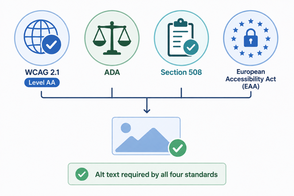
Section 508 applies to federal agencies and organizations that work with them. It has its own accessibility requirements, including alt text for images.
The Web Content Accessibility Guidelines (WCAG) 2.1 Level AA are the international standard for web accessibility. They’re referenced by accessibility laws in many countries. WCAG requires text alternatives for all meaningful images.
The European Accessibility Act (EAA) has been in effect since June 2025. It applies to businesses selling products or services to consumers in the European Union. Alt text is required under the EAA for image accessibility.
Missing alt text is one of the easiest accessibility failures to detect. Automated scans can flag it in seconds. That makes it a common trigger in accessibility complaints and lawsuits. The good news is that it’s also one of the easiest issues to fix.
If accessibility compliance matters for your business (and increasingly, it does), alt text is one of the first things I recommend auditing and fixing.
Alt Text for Videos and Non-Standard Content
A quick word on some special cases that come up often.
Alt text for video accessibility
Videos don’t use alt text in the traditional sense. But they have accessibility requirements of their own.
Video accessibility usually involves captions for the audio content, transcripts of the spoken content, and audio descriptions of important visual content that isn’t otherwise described. These serve the same function as alt text for images but work differently technically.
If you use a video thumbnail image that links to a video, that image should have alt text describing the video. Something like: alt=”Video thumbnail: How to bake sourdough bread”. The thumbnail image is static and follows regular alt text rules.
Alt text for icons
Icons are tricky because they can be functional, decorative, or both.
If an icon is functional (like a link or button), the alt text should describe what it does. For a magnifying glass icon that opens search: alt=”Search”. For a hamburger menu icon: alt=”Open menu”.
If an icon has a visible text label next to it (like a search icon with the word “Search” next to it), the icon itself can have an empty alt attribute. The visible text already conveys the meaning to all users. Adding alt text would just make screen readers announce the same thing twice.
If an icon is purely decorative and doesn’t do anything, use an empty alt attribute.
Alt text for SVGs
SVGs work differently depending on how they’re used. If an SVG is used as an external file via an <img> tag, use the alt attribute like any other image.
If the SVG is inline (embedded directly in the HTML), use a <title> element inside the SVG code instead. Something like:
<svg role=”img” xmlns=”http://www.w3.org/2000/svg” viewBox=”0 0 24 24″>
<title>Download icon</title>
<path d=”M12 16l-6-6h4V4h4v6h4l-6 6z”/>
</svg>
The role=”img” tells screen readers to treat the SVG as an image. The <title> provides the description.
Filenames and Accessibility (Yes, They Matter Too)
I want to touch on something most alt text guides skip: filenames.
Your image filename isn’t just for you. It’s a backup for accessibility.
If your alt attribute is accidentally missing (it happens more than you’d think), some screen readers default to reading the filename aloud. If your filename is IMG_4729.jpg, the user hears “I-M-G underscore four seven two nine dot jay pee gee.” Useless.
If your filename is merino-wool-hiking-socks-grey.jpg, the user hears something they can actually parse: “merino wool hiking socks grey dot jay pee gee.” Still not ideal, but far more useful.
Descriptive filenames aren’t a replacement for alt text. But they’re a safety net for the moments when alt text fails.
My filename rules
Use hyphens between words, not underscores. Google reads hyphens as spaces. Underscores get read as a single joined word.
Use lowercase only. This prevents URL encoding issues.
Skip special characters, spaces, and symbols. Stick to letters and numbers.
Be descriptive but concise. Three to five words is the sweet spot.
Never use camera-generated filenames like IMG_4729.jpg or generic names like image1.jpg.
Rename the file on your computer before uploading it. Renaming in your CMS often only changes the display title, not the actual file URL.
What AI Alt Text Tools Get Wrong
I use AI tools for a lot of things. But when it comes to alt text, I’ve learned to be careful.
AI can generate a first draft of alt text quickly. That’s useful for large sites with lots of images. But AI has real limitations that make it unsuitable as the final authority.
AI can’t understand context. It analyzes what’s in the image (a person, a laptop, a room) but doesn’t know why the image is on the page or what it’s meant to convey. The same image can need completely different alt text depending on where it appears. AI doesn’t know that.
AI misidentifies things. I’ve seen AI describe a chair as a sofa, a woman as a man, a dog as a cat. When AI gets it wrong, the alt text is worse than useless. It actively misleads the user.
AI reflects biases. AI trained on internet data can produce alt text that includes stereotypes, unnecessary demographic details, or biased phrasing. For accessibility, this is a real problem.
AI is too vague or too specific. AI descriptions often either lack the detail that matters (“a man standing”) or include so much irrelevant detail that they become unusable (“a man standing in a room with white walls wearing a blue shirt with a red logo and holding a coffee cup with steam rising from it”).
My approach: I let AI generate a draft. Then I edit every single one. I check accuracy. I check the context. I trim what doesn’t matter and add what does. The AI saves me a small amount of time. It doesn’t replace human judgment.
Frequently Asked Questions
What is alt text for images and why does it matter for accessibility?
How do I write alt text for accessibility?
Are there examples of alt text for accessibility I can reference?
What are the image alt text accessibility requirements?
How does alt text relate to ADA compliance?
How do I evaluate alt text accessibility on a website?
How do I write effective alt text for complex infographics?
What is alt text for icons in accessibility?
What about alt text for video accessibility?How do I get started?
Can I use AI to write alt text and stay accessible?
The Bottom Line
Alt text is a small thing that does a lot. It’s a few words of text that make the difference between a webpage that works for everyone and one that shuts out entire groups of users.
I’ve been writing alt text for years now. And I’ve learned that the sites that get accessibility right aren’t the ones with the biggest budgets or the fanciest tools. They’re the ones that build good habits. Alt text at upload. Empty alt attributes on decorative images. Descriptive filenames. A quick review before publishing.
Do those things consistently, and your site will be more accessible than most of the web. Do them for a while, and you’ll stop thinking about it as an extra step. It just becomes how you build.
If you’re not doing this yet, start with your highest-traffic pages. Add alt text to every meaningful image. Use empty alt attributes for decorative images. Run a Lighthouse audit to catch anything you missed. Then move to the next batch of pages.
You don’t have to fix everything at once. You just have to start.
Leave a Reply